Tip #50: 6 tips to create effective public forms in Qntrl

Public Forms
in Qntrl are digital forms that can be hosted on the web to be filled by any audience. It can be used to collect responses as surveys, questionnaires, polls, or even feedback.
The theme of each form may vary depending on why it is created, whom it is shared with, and also the findings it is expected to bring forth. To design each form aesthetically depending on these factors, here are a few tips.

1. Choose an appealing background
Backgrounds can accentuate the details of the form and make it look pleasing for the user. Qntrl supports a bunch of backgrounds with different themes and colours to pick from.
Click
 and choose a background listed under
Change Background. After choosing a background, click
Preview
to view the form in the selected background.
 and choose a background listed under
Change Background. After choosing a background, click
Preview
to view the form in the selected background.
2. Personalise form logo
By default, public forms display Qntrl’s logo. However, this can be customized to display your own company’s logo too.
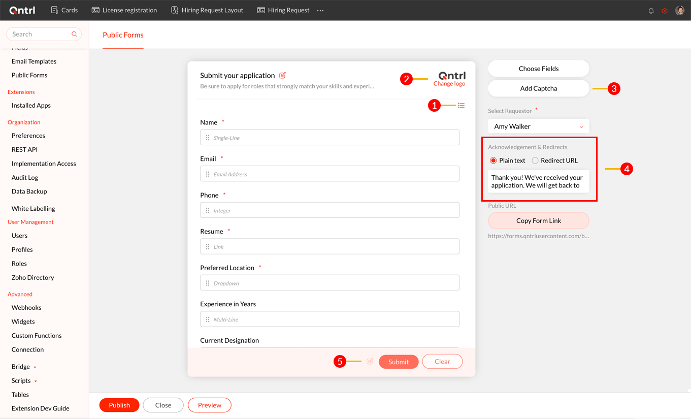
Hover over Qntrl’s logo while creating or editing the form and click
Change Logo. Upload the new logo to display in the form.
3. Improve security with Captcha
Qntrl allows you to add captcha to your forms to ensure only a human being is filling out your form. It blocks robots from submitting fake information or junk data to your forms.
Click the Add Captcha
button at the right corner to automatically add captcha to your forms.
4. Write an impressive thank-you message
Once a user fills out the form and submits it, you can customize a message for them. This can be a confirmation message, a thank-you message, or even expected wait time in case of a complaint or feedback form.
You can also choose to redirect the audience to a different URL—like your website—once they fill in the form.
You can configure these under
Acknowledgements and Redirects.
5. Customize the CTAs
The Call To Action (CTA) buttons at the end of each form prompts users to take the right action after filling the form. These button names can be customized in each form.
By default the options are Submit and Clear. To customize this, click
 and update the button names.
 and update the button names.
6. Keep users informed about inactive forms
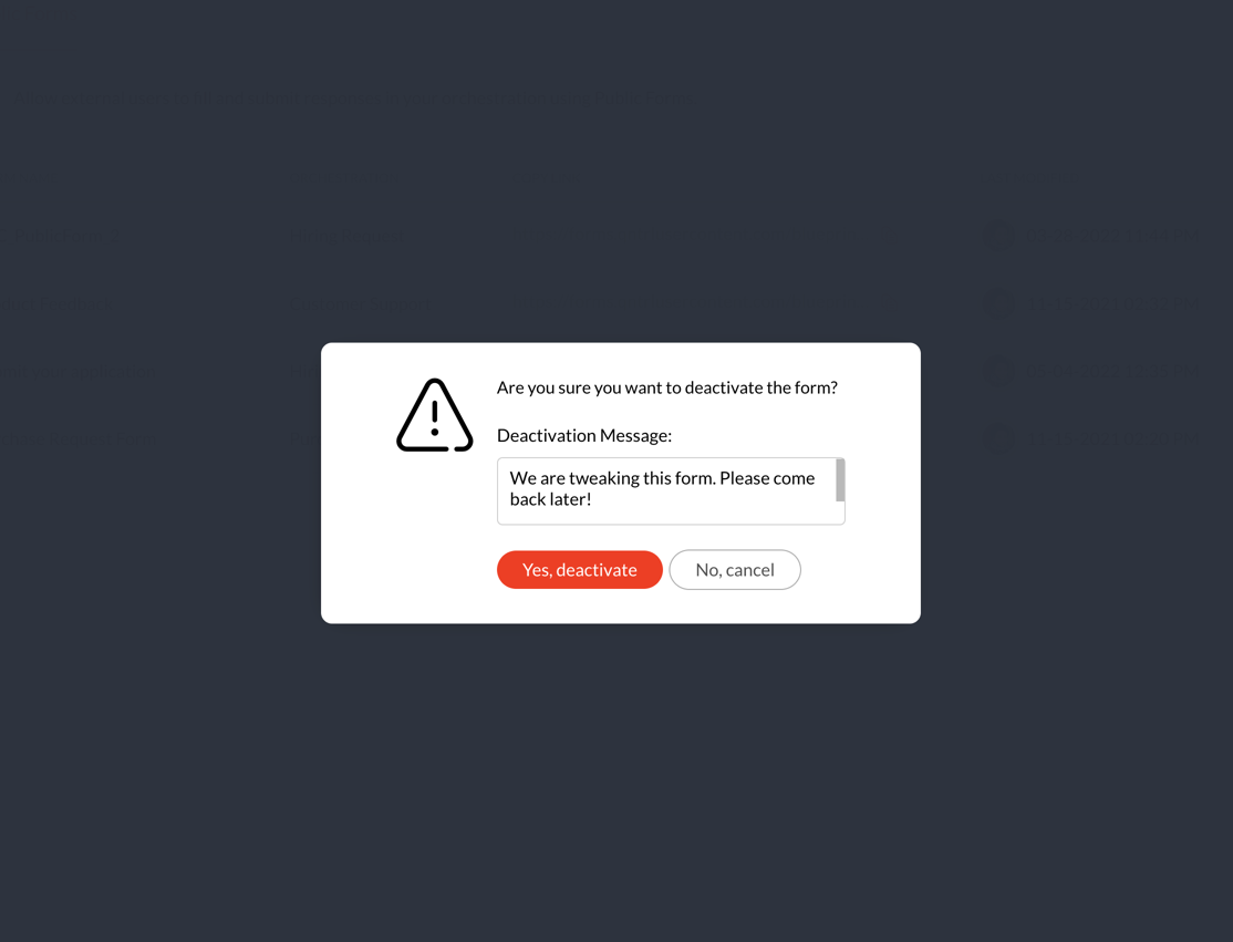
Since public forms have public URLs that can be accessed by anyone, anytime, we need to keep users informed if a form is disabled or under maintenance.

When you try to disable a form, Qntrl prompts a popup where you can enter the deactivation message.
We hope these tips are useful for you. If you have any suggestions or queries, do email us at
support@qntrl.com.
Topic Participants
Saranya Baskaran Lakshmi
Deniz
Ajith Kevin Devadoss